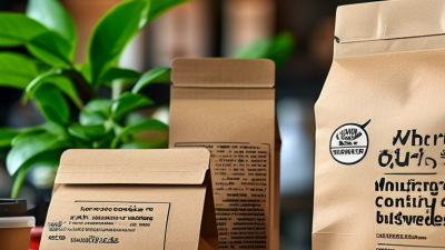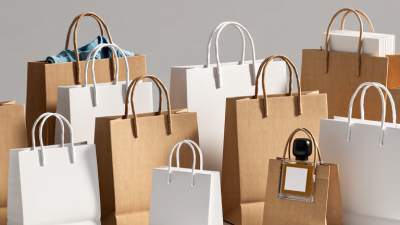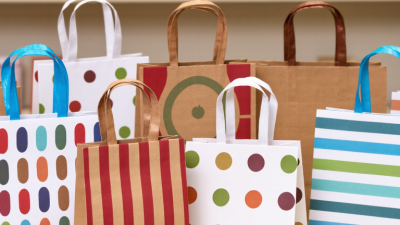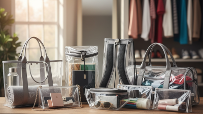


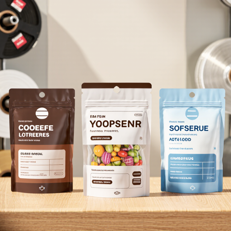
Custom packaging bags should make your product easy to recognize and its key details easy to find. Start with the bag’s viewing distance: a small pouch on a crowded shelf needs bold lettering, clear contrast, and one memorable visual element. Check your logo at its actual printed size, not only on a bright computer screen. Colors can shift on different materials, and fine lines may blur on textured film. Ask your printer for a physical proof, then inspect it under ordinary store lighting. It is a small step, but often revealing.
Tips: Keep the front uncluttered. Put product name and essential details where shoppers can scan them quickly. Reserve a readable area for ingredients, net quantity, storage guidance, or other information relevant to your product and market.
Requirements vary, so confirm wording and placement with a qualified packaging or regulatory professional before approving artwork. Leave enough space around text; crowded panels are hard to read. Test a filled sample, too. Seams and folds can hide details.
Printing choices affect both appearance and practical use.
A matte finish can soften glare, while a glossy surface may make colors look brighter; neither suits every product. Choose ink and material compatibility with your supplier, especially if bags face moisture, friction, or temperature changes.
Review spelling, contrast, and information hierarchy on the final proof. A rushed approval can leave a costly little mistake. Sometimes the first layout feels polished, yet a real shelf test shows the product name is still too small.